Introduction
The home page of the University of York is orderly, colorful and intriguing [1]. The report will demonstrate some basic information asked by task sheet and evaluate the website according to Shneiderman’s Eight Golden Rules, Nielsen’s Usability Heuristics and WCAG 2.0 correspondingly.
Basic Information
Through clicking several buttons from the home page of the University of York, the following information is available without using any search function.
Table 1 Some Basic Information and Access Method
| Task | Information | Access Method |
| Name of the University | University of York | Official logo; the title bar |
| Vice-Chancellor | Professor Koen Lamberts | “About” of the menu bar |
| Term dates | From academic year 2017/18 to 2025/26 for Undergraduate, Postgraduate Taught, Postgraduate Research and Previous Years | The highlighted button “Term dates”; “Quick links” menu |
| Accommodation | https://www.york.ac.uk/study/accommodation/ | Under “Campus and city life” column |
The University of York does have the Department of Computer Science. Under “BSc Computer Science” major, various intriguing and classical computer science courses will be offered, including but not limited to Mathematical Foundations of Computer Science & Introduction to Computer Architectures (Year 1), Principles of Programming Languages & Systems (Year 2) and Computer Vision & Machine Learning and Applications (Year 3). Additionally, the specifications of all courses are available via clicking the title of the subject. All other courses of all other majors related to computer science will be found through a similar section.
The library webpage of the University of York is similar to the library webpage of The University of Liverpool functionally, but different specifically. Both library webpages have essential functions, including but not limited to “Discover” and “Electronic Resources (databases, E-Journals)”. However, for the library webpage of the University of Liverpool, many user-friendly icons will improve the efficiency of using the website. For the library webpage of the University of York, it focuses on displaying more kinds of functions. Therefore, it is lack of visual icons, but more texts. This may decrease the efficiency of using the website greatly.
There are two search functions shown on the home page. One for a general search, another for specific courses search. By testing, most information above can be available directly with general search. Generally, the search function performs well. Other details will be illustrated following.
Evaluation with Shneiderman’s Eight Golden Rules
- Strive for consistency [2]
The whole layout of the site is clear, and each section performs its own functions well. However, the menu bar and the corresponding subpages failed to follow the consistency. The first scenario is, when the user tries to click the “Study” block, however, the webpage with the title “Study at York” will be popped up. Apparently, two different titles will be easily misunderstood by users. The second scenario is, when “Business” block of the menu bar is clicked, the webpage shown as Figure 1.3 will be popped up. The layout, background color and even the menu bar of the subpage have a various difference compared with the home page.
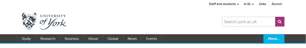
Figure 1.1 The menu bar of the home page
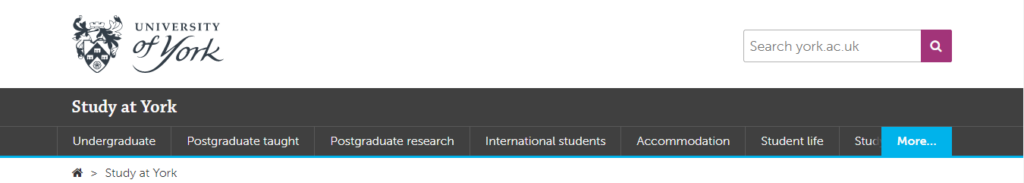
Figure 1.2 The menu bar with clicking “Study” block
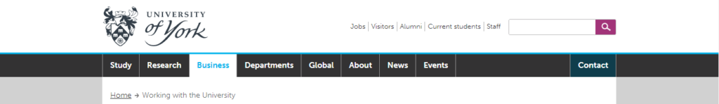
Figure 1.3 The menu bar with clicking “Business” block
- Enable frequent users to use shortcuts
By testing, the basic shortcuts based on Windows system can be called.
- Offer informative feedback
At the junior stage, most manageable options can give suitable responses to users.
- Design dialog to yield closure
On the condition that users aim to download the documents from the website, there is no dialog popped up due to browser reasons. However, the users are still able to further customize in the bar shown as Figure 2.
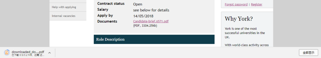
Figure 2 The dialog of the downloading task
The search function in the university website uses “fuzzy search” technology. That is, it can return users the most similar keywords when the input of users cannot be found in the databases. In this case of Figure 2.1, given the original key words “tuicion fe” but aims to find information related to “tuition fee”. The system cannot find any information related to “tuicion fe”. However, it recommended the user to re-search with “tuition fee” – “Did you mean tuition fee?”. The search function did not return the results of “tuition fee” but gave an optimal recommendation to users.
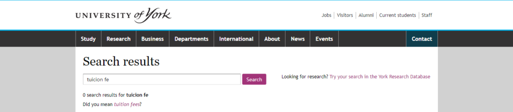
Figure 2.1 The search results with “tuicion fe”
In another case with entering a wrong and random URL based on https://www.york.ac.uk/ such as Figure 2.2, the website reminds the user that shown as Figure 2.3. Additionally, it offers users to report the wrong link/potentially broken link to the system. Therefore, the website is able to offer simple error handling perfectly.

Figure 2.2 The wrong URL example

Figure 2.3 The corresponding page to the aforementioned URL
- Permit easy reversal of actions
The home page offers users to use another search function to find a course directly in terms of different diploma degree. “Computer Science” was inserted into the search box in this case. After returning to this page from the newly loaded page, the insertion of “Computer Science” remained.
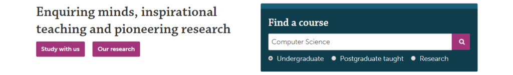
Figure 3 “Find a course” function
- Support internal locus of control
The corresponding hyperlinks will change the color from the normal one to the lighter one when the cursor floats on the hyperlinks. There are no underlined or text sizes changes. As shown in the 5th principle, to the potentially wrong input of users, the system will return an optimal recommendation to the user instead of a direct correction.
- Reduce short-term memory load
The suitable rate of texts and pictures creates a comfortable environment for users to visit the website. Not only it is intriguing for them to explore further related information, but it is easier for them to understand it instead of showing boring texts merely.
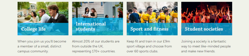
Figure 4 Mixed pictures and texts
Evaluation with Nielsen’s Usability Heuristics
According to the work of Nielsen’s and the facts, generally, the website does well in the following fields:
- Visibility of system status [3]
The highlighted title of each webpage offers users a clear status of website location and what topic is showing on currently.
- Match between system and the real world
The language which the website using is similar to plain English, or more user-friendly which oriented to prospective/current university students/staff.
- Help users recognize, diagnose, and recover from errors
- Aesthetic and minimalist design
From aesthetic perspective, the layout of the website is clear, and the color matching is suitable and optimal. Other than essential texts and helpful pictures to understand, normally there are no supernumerary texts. Every hypertext or subpage has its own corresponding function and different from each other.
- User control and freedom
- Recognition rather than recall
Most subpage will show the path from the home page to the current page on the top bar. It is easier for users to return the previous webpage whenever they want and need with one click.
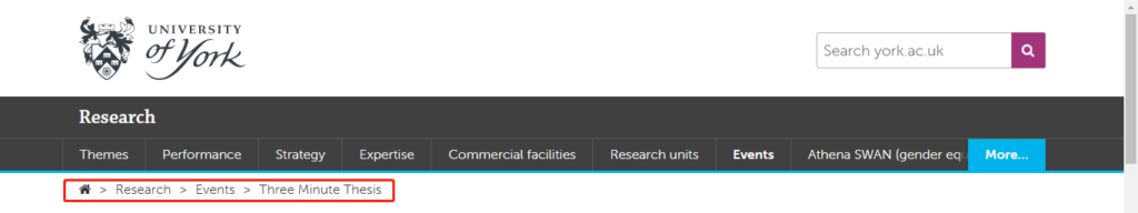
Figure 5 Pathway
- Flexibility and efficiency of use
For expert users, specifically are current students or staff, in this case, they may want to achieve more other functions related to personal information other than general introduction related to the university. Then it is a good way to go to the foot bar of the home page, then click the specific page for the specific groups of people, such as “current students” and “staff”. Inside of the webpage to “current students”, there are more functions for students to use, including but not limited to “campus email, university calendar, timetable”, which are for expert users but not for novices.
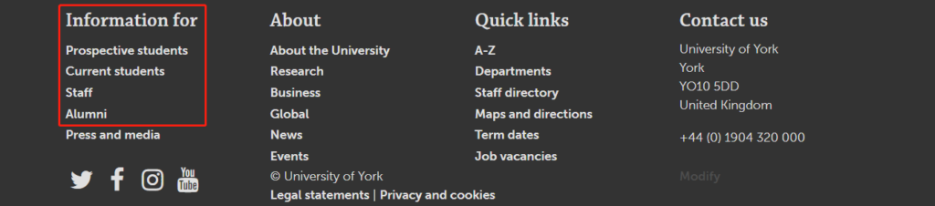
Figure 6.1 Entrance for expert users
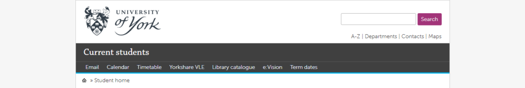
Figure 6.2 The page for current students
However, the website fails to consider the following principles or is weak on:
- Consistency and standards
- Error prevention
In the “tuicion fe” scenario aforementioned, if search function can offer some frequent searched keywords in advance for users to choose instead of asking users to input, it may decrease the failure and problem. Additionally, this way greatly saves the time of users.
- Help and documentation
Some documentations are needed to download frequently in order to achieve further specific information as shown in Figure 7. It is tough for users to search keywords to obtain the information but need to enter the right pathway and find the documentation area to download. This may decrease the efficiency of users.

Figure 7 Area to download
Evaluation with WCAG 2.0
- Operable [4]
The user-friendly menu bar and other navigation bar help users to find the information they want. Most of the pictures on the website are benign, which build a comfortable environment for users. Additionally, all operations can be done with a keyboard and a mouse. It is also worth indicating that most operations can be executed by mouse with merely a click but can hardly be executed by keyboard (except input operations).
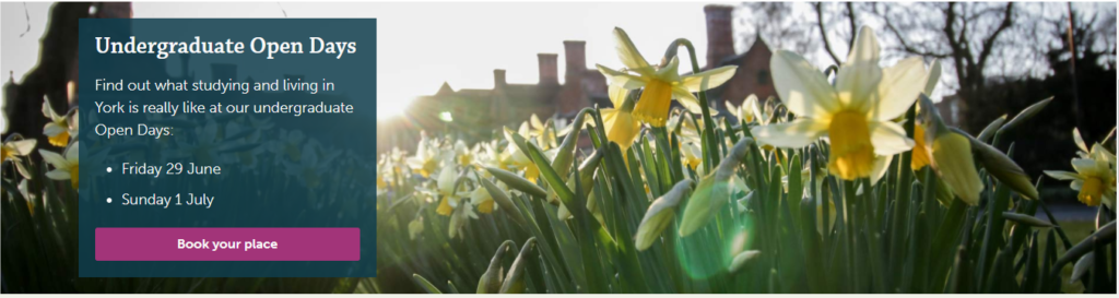
Figure 8.1 Suitable pictures adopted
However, the left menu bar of some subpages is unsuitable, specifically the text size is so small (even smaller than the text size of the main body) that users need some time to distinguish each block.
Figure 8.2 Unsuitable text size of the menu bar
- Understandable
As proved aforementioned, for the search function, the website can return an optimal recommendation when the input of the users cannot be found in databases. It helps users correct mistakes. In addition, the plain English setting considers a general group of people to understand the content on the website. It will be better than the hypertext will show the basic information or brief introduction without popped up new subpage when the cursor floats on the corresponding hypertext.
References
[1] (2018, Apr. 29). University of York [Online]. Available: https://www.york.ac.uk/
[2] B. Shneiderman et al., Designing The User Interface: Strategies For Effective Human-Computer Interaction. Boston, Massachusetts: Pearson, 2017.
[3] (2018, May. 1). 10 Heuristics for User Interface Design: Article by Jakob Nielsen [Online]. Available: https://www.nngroup.com/articles/ten-usability-heuristics/
[4] (2018, May. 1). WCAG 2.0 at a Glance | Web Accessibility Initiative (WAI) | W3C [Online]. Available: https://www.w3.org/WAI/WCAG20/glance/Overview